TYPOGRAPHIC TECHNICAL SERIES FOR APPRENTICES—PART VI. NO. 38
THE USES OF ITALIC
A PRIMER OF INFORMATION
REGARDING THE ORIGIN AND
USES OF ITALIC LETTERS
BY
FREDERICK W. HAMILTON, LL.D.
EDUCATION DIRECTOR
UNITED TYPOTHETAE OF AMERICA

PUBLISHED BY THE COMMITTEE ON EDUCATION
UNITED TYPOTHETAE OF AMERICA
1918
Copyright, 1918
United Typothetae of America
Chicago, Ill.
CONTENTS
| PAGE | |
| Historical Introduction | 1 |
| Rules for the Use of Italic | 5 |
| Supplementary Reading | 16 |
| Review Questions | 17 |
THE USES OF ITALIC
HISTORICAL INTRODUCTION
The first types were cut in imitation of the Gothic orblack letter handwriting employed at that period incopying Bibles, missals, and the like. It was large andangular and the lines were very coarse and black. Thesepeculiarities gave it the name. Its characteristics made iteasy to read even in the dim light of a church or by thefailing eyes of the aged. This form of type, however, wasonly suitable for large pages. When reduced in size itbecame very difficult to read, being an almost indistinguishableblur on the page.
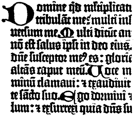 Type of the Mazarin Bible (exact size).
The cost of materials and the unwieldiness of the greatfolio volumes soon caused a demand for smaller books.Gutenberg's 36-line Bible was almost immediately replaced[2]by the 42-line Bible. A reduction of one sixth in the numberof pages of a book as large as the Bible would effect avery important saving in the cost of material and labor,especially when we remember that the early printing presswas a very laborious and slow affair. Gutenberg's presswas capable of printing only twenty sheets an hour, or one[3]sheet every three minutes. The invention of the movablebed, about the year 1500, increased the output of the pressto two hundred sheets an hour. In 1786 the speed hadrisen only to two hundred and fifty sheets an hour. Cheapprinting waited for the application of power to machinery.
The big book with the big type was well enough forchurches and libraries. But the purpose of printing was